Effective Use of Negative Space in Web Design
In the world of web design, where attention is a scarce resource, every element on a webpage must play a significant role. From vibrant colors to captivating images, designers often strive to create visually stunning and attention-grabbing websites. However, in this pursuit of visual brilliance, the powerful potential of negative space often goes unnoticed. Negative space, also known as white space, is the blank area surrounding the main elements on a webpage. It might seem counterintuitive to leave parts of a design empty, but when used effectively, negative space can be a powerful tool to enhance user experience, emphasize key elements, and create a harmonious visual balance.
In this article, we will delve into the concept of the effective use of negative space in web design and explore how it can elevate the overall user experience. We’ll go beyond the surface and provide detailed insights into the five key principles of incorporating negative space. Additionally, we will showcase real-world examples of websites that have mastered the art of using negative space effectively to create exceptional user experiences.
The Purpose of Negative Space in Web Design
Negative space is not mere emptiness; it serves a crucial purpose in web design. The strategic use of negative space allows designers to guide the user’s focus to the most essential elements on a webpage, such as calls-to-action, headlines, and crucial information. Without adequate negative space, a webpage can feel cluttered, overwhelming, and confusing, leading to a poor user experience.
When used effectively, negative space creates breathing room for the eyes, making the content more readable and easily digestible. It provides a visual resting place, allowing users to process information more efficiently. Moreover, negative space improves the legibility of text, especially in lengthy paragraphs, making it less daunting for visitors to engage with the content.
Imagine a landing page for an online course with a large hero image at the top, followed by a clean layout with generous negative space surrounding the course benefits and a clear call-to-action button. In such a design, the negative space acts as a spotlight, drawing immediate attention to the call-to-action, encouraging user engagement, and ultimately increasing conversions.
Enhancing User Experience
In the fast-paced digital era, users tend to skim through websites, seeking relevant information quickly. The effective use of negative space can significantly improve the user experience by guiding visitors to the most critical content and preventing them from feeling overwhelmed.
By providing visual cues, negative space helps users navigate a webpage with ease. It can separate different sections, making it clear where one section ends and the next begins. This clarity enhances the website’s overall organization and usability.
Consider an e-commerce website with a grid-based product listing. Each product card is well-spaced, allowing the user’s eyes to distinguish between different items effortlessly. This use of negative space reduces the cognitive load on the user, enabling them to browse through the products more comfortably and increasing the chances of finding what they are looking for.
Emphasizing Key Elements
One of the most powerful uses of negative space in web design is its ability to highlight and emphasize essential elements. By surrounding a specific element with ample negative space, designers draw the user’s attention to it immediately.
For instance, a product image with sufficient white space around it will make the item stand out, encouraging users to focus on the product’s details and features. Negative space can also be used to emphasize headlines, important quotes, or any other content that deserves special attention.
Imagine a nonprofit website advocating for a cause. Placing a thought-provoking quote or statistic surrounded by ample negative space can create a visual impact, conveying the urgency of the cause and compelling visitors to take action or explore further.
Achieving Visual Balance
A well-designed website is like a delicate dance of elements, each playing its role in harmony. Negative space acts as the conductor of this symphony, ensuring that no element overshadows the others. It creates a visual balance that keeps the design aesthetically pleasing and engaging.
Excessive negative space might make a website look too sparse, causing it to lose its impact. On the other hand, insufficient negative space can lead to a chaotic and overwhelming design. Striking the right balance is crucial for maintaining a design that is both visually appealing and functional.
Consider a portfolio website showcasing a photographer’s work. With the appropriate amount of negative space between each photograph, the design becomes inviting, allowing the images to breathe and speak for themselves. This visual balance creates an engaging and enjoyable browsing experience for the visitor.
Fostering Emotional Connections
Web design is not just about providing information; it’s also about eliciting emotions and creating memorable experiences. Negative space can contribute to this emotional connection by evoking feelings of calmness, elegance, and sophistication.
When visitors encounter a website with thoughtful negative space, it instills a sense of professionalism and attention to detail, which can positively influence their perception of the brand or product. This emotional resonance can help build trust and credibility, leading to increased engagement and brand loyalty.
Imagine a luxury fashion brand’s website, where generous negative space is used to showcase individual products, creating an aura of sophistication and exclusivity. This careful curation of negative space fosters an emotional connection with the brand, appealing to the desires of the target audience.
Examples of Websites Utilizing Negative Space Effectively
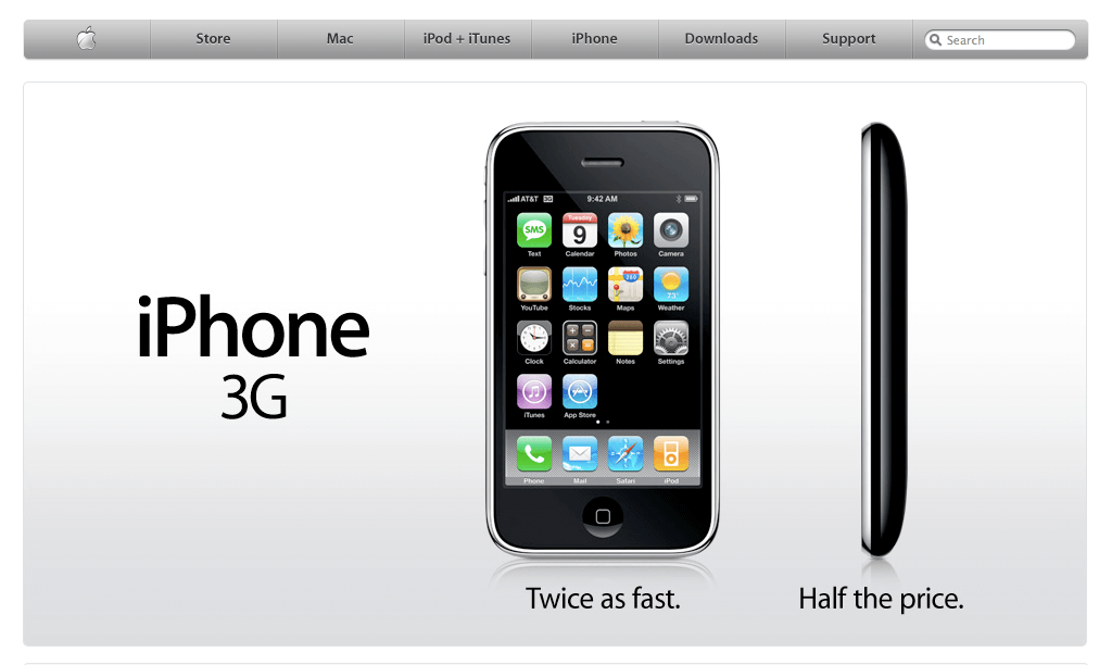
Apple – www.apple.com
Apple’s website is a prime example of how negative space can be used effectively to create an elegant and sophisticated design. The homepage is clean, with plenty of white space surrounding each product image. The negative space allows the products to shine, while the minimalistic design fosters a sense of high-end craftsmanship and user-centric focus.
The navigation menu is unobtrusive, with ample negative space around it, ensuring that the user’s focus remains on the products. The strategic use of negative space guides visitors effortlessly through the website, creating an intuitive and enjoyable browsing experience.
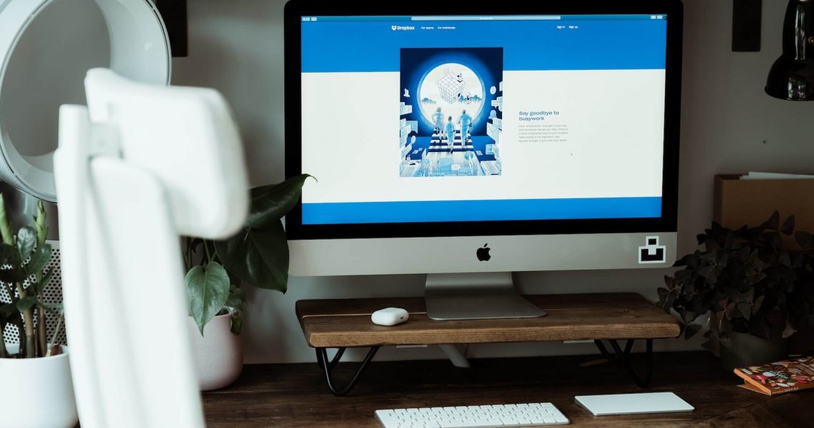
Dropbox – www.dropbox.com
Dropbox’s website demonstrates how negative space can be used to guide users through complex information. The design is minimalistic, with ample white space separating different sections, making it easy for visitors to grasp the main message.
The landing page features a clean layout with generous negative space surrounding the product’s benefits. This use of negative space allows users to process the information at their own pace, without feeling overwhelmed by an excessive amount of content. The result is a user-friendly interface that effectively communicates the product’s value proposition.
Conclusion
The effective use of negative space in web design is an art that can elevate the user experience and communicate a brand’s values and personality. By understanding the purpose of negative space and adhering to the key principles of its incorporation, designers can create websites that are not only visually stunning but also highly functional.
When utilized strategically, negative space enhances the overall user experience by emphasizing essential elements, fostering emotional connections, and achieving visual balance. It guides users through a webpage, making navigation intuitive and content consumption effortless.
As the digital landscape continues to evolve, web designers must embrace the power of negative space, recognizing it as a crucial tool to create impactful and memorable designs. So, let us all celebrate the void and make the most of negative space in web design to craft extraordinary online experiences.